ANDREW WICKSTROM
ART DIRECTOR / CPG / BRAND & IDENTITY DESIGNER
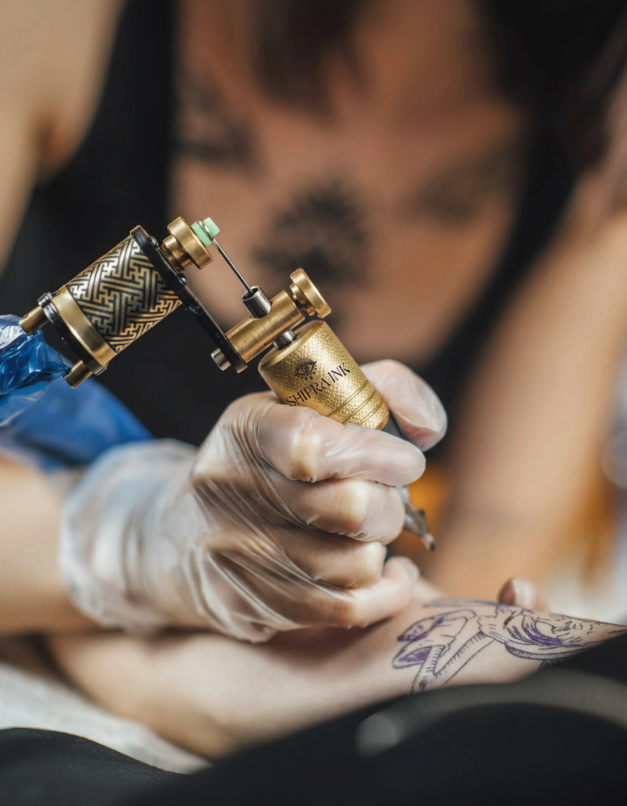
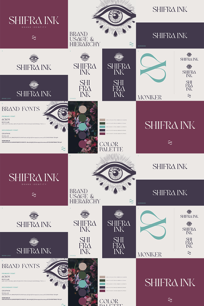

Brand Creation: Shifra Ink
Shifra was created as a brand rooted in meaning, care, and intentional transformation. The name “Shifra” has Hebrew origins and translates not simply as “beautiful,” but as to beautify—to make something endearing through care, attention, and love. It speaks to improvement not as correction, but as elevation.
The name references the biblical figure Shifra, one of the midwives who helped bring life safely into the world. In tradition, Shifra is associated with nurturing and preparation—cleaning and caring for newborns, helping them enter the world whole and protected. This idea of making beautiful through care became the emotional foundation of the brand.
The brand ethos balances softness and strength: lovely, intricate, delicate, bold, and organic. Every visual element was designed to feel intentional and human—celebrating inner beauty, emotional depth, and quiet confidence rather than surface perfection. Shifra is not about being beautiful for appearance’s sake; it is about being made beautiful through love, patience, and heart.
The resulting identity system reflects this duality—refined yet expressive, delicate yet grounded—creating a brand that feels intimate, soulful, and enduring.
Client: Shifra Ink
Brand Designer: Me